The Brief
Laxmi Sunrise Bank had a salary advance benefit for their employees that most employees didn’t use. Not because they didn’t need it, but because the process was unclear, paper-based, and required physically going to HR and waiting a few days for approval. So most people just didn’t bother.
The ask was to make this digital and self-serve on mobile. My job was to design the full experience: from figuring out if you’re eligible, to choosing how much you want, to understanding exactly what you’ll repay, to tracking those repayments against your salary.
What I Studied First
Before designing anything, I looked at how other salary advance and earned wage access products handle this: Earnin, PayActiv, Revolut’s salary feature. The thing they all get right when they do it well is transparency. They show you the cost upfront, in plain language, before you commit. The ones that get it wrong bury the interest rate in terms and conditions and show you a big green “Get Cash Now” button.
I decided early that this product was going to be the transparent kind.
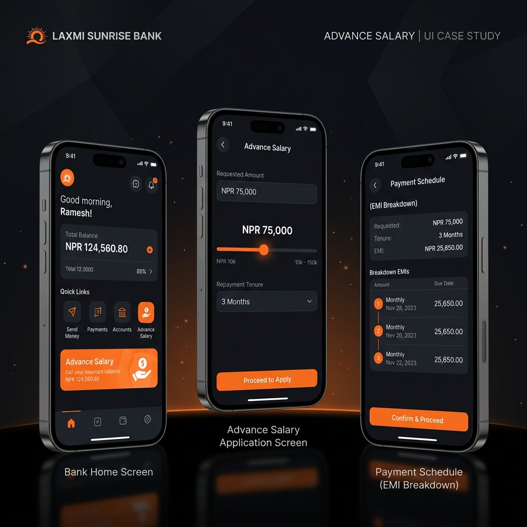
The Guiding Principle: No Surprises
Every screen in the application flow shows you exactly what you’re agreeing to before you move forward. There’s no moment where you tap confirm and then discover something unexpected on your next payslip.
The flow goes: eligibility check, then amount selection (with a slider), then tenure selection (3, 6, or 9 months), then a full review screen that shows you the EMI, total repayable, interest rate, and the date your first deduction happens. Only after that do you confirm.
The EMI Slider
This is the part I spent the most time on. As you drag the amount slider, four numbers update in real time: the monthly EMI, the number of months, the total interest, and the total repayable. People can see immediately how choosing NPR 80,000 instead of NPR 50,000 affects their monthly take-home pay.
I tested a version where these numbers updated with a slight delay (for animation reasons). Users in testing didn’t trust it. They thought the numbers might not be correct yet. Removing the delay entirely and making the update instant fixed that. When it feels like a calculator, people trust it.
Showing the Repayment Timeline
After disbursement, users can see their upcoming deductions laid out as a visual timeline. I designed it as a calendar-style sequence of nodes rather than a table. Each node shows the date, the amount, and a running total of what’s been paid.
The difference between a table and this timeline is psychological. A table makes you count. The timeline makes it obvious at a glance how many payments are left. That reduces anxiety about what you signed up for.
Working Within the Bank’s Brand
The bank has an existing mobile app with a deep navy and gold palette. I kept the brand palette intact but modernized the UI language within it — cleaner cards, more whitespace, a less dense layout than the legacy app. The advance salary feature needed to feel new and trustworthy, not bolted on as an afterthought.
The Outcome
The bank’s digital transformation team approved the prototype as the reference design for development. In usability testing, three out of five sessions completed the full application flow with no drop-offs. The stakeholders specifically mentioned the EMI transparency model as something their competitor’s product didn’t offer.
That part felt like the research had done its job.