How This Started
This was a freelance project. Growphase Labs is a software development company based in Nepal that builds web and mobile products for startups and SMEs. Their original website existed, but it wasn’t doing any of the work a company website should do. No clear value proposition, no visual identity beyond a logo, no structure that told a visitor what they’d actually get by hiring them.
I came in as both designer and developer. My job was to figure out what was wrong, propose something better, build it, and ship it.
Understanding the Problem First
Before touching Figma, I spent time looking at what their competition was doing well. B2B software company websites that convert well tend to share a few things: a clear headline that states exactly what you get, social proof that comes before the services section (not after), and a very low barrier to the first contact action.
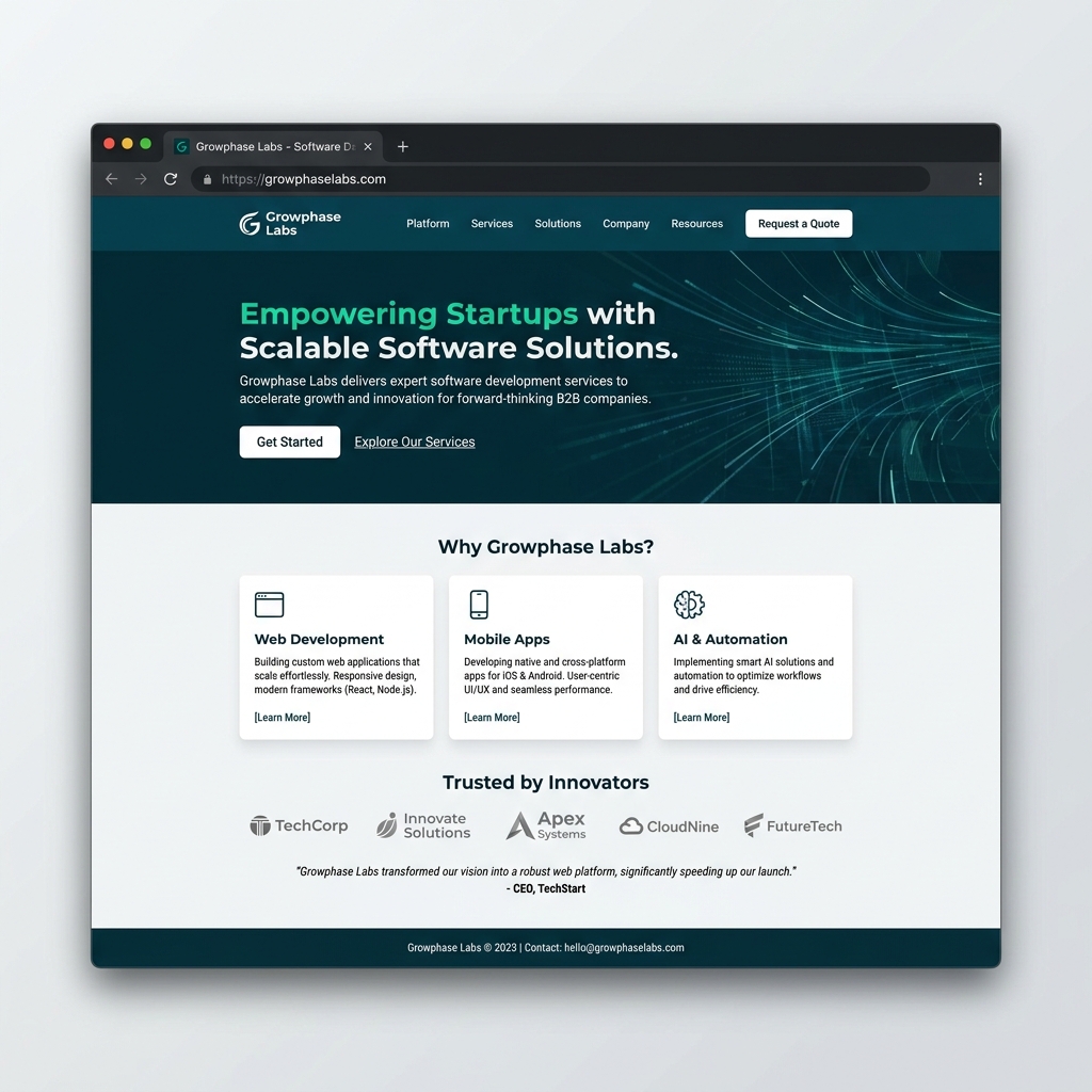
The original Growphase site had none of that. The hero section was literally just their logo. Visitors had no way to understand within five seconds whether this company was right for them. That’s a conversion problem before it’s a design problem.
I put together a short audit — what was missing, what the competitors were doing, and what I thought needed to be true for this site to work. Then I proposed a redesign direction to the client before building anything.
The Design Process
I worked through Figma first. I designed the full page, got client sign-off on the direction, then moved into code.
The structure I proposed followed a deliberate funnel:
The hero leads with a concrete value proposition: what does Growphase Labs do, for who, and why should you care. Not a mission statement, not a tagline. A specific claim.
Below that, a capabilities section showing the actual services clearly: web development, mobile apps, and digital transformation consulting. Each with a real description, not marketing copy.
Then social proof — testimonials or client logos, depending on what the client could provide — to build trust before someone decides to reach out.
Then a case studies or product section showing actual work, followed by a contact CTA.
This is a proven funnel structure for B2B services. I didn’t reinvent it, I just made sure Growphase actually followed it.
Building It
I built the site in Next.js with Tailwind CSS. The original site was on a no-code platform that gave the team very limited flexibility for future updates. Moving to Next.js meant they could add a proper blog (they had one in the nav but nowhere to put it), eventually add server-side rendering for SEO, and have a codebase that a developer could actually maintain.
The implementation focused on three things that directly affect bounce rate: page load speed, mobile layout, and first-scroll clarity. If someone lands on your site and the first thing they see on mobile is a logo and some floating text, they leave. Getting the mobile hero right was a priority.
I set up the component structure so the team could update text and add new case studies without needing to touch the layout code. Tailwind kept the styling consistent without a design system overhead they didn’t need.
What the Original Site Was Missing
It’s worth being specific about what was actually wrong, because the problems were distinct:
No clear page hierarchy. Everything felt equally weighted, so nothing stood out as the most important thing to read first.
No conversion funnel. The site didn’t guide a visitor from “who are you?” to “I want to talk to you.” There was no progression.
Weak typography. The original fonts were browser defaults. Typography is a large part of how professional a service company looks.
No visible brand identity beyond the logo. The color palette was inconsistent between sections, and spacing felt random.
The redesign addressed all of these directly. Each section has a clear purpose, the visual weight guides your eye down the page, and the brand feels intentional rather than assembled.
Outcome
The redesigned site is live at growphaselabs.com. The client approved the final design after one round of minor copy adjustments. No structural changes needed after the Figma sign-off, which is usually a sign the design process did its job.
This project was a good reminder that sometimes the right answer for a company isn’t a complex design system or a custom CMS — it’s just a well-structured, fast page that says the right things in the right order.