The Problem I Kept Thinking About
Nepal has a blood supply problem that nobody really talks about. Blood banks are running on paper ledgers and phone calls. If you need a specific blood type urgently, you’re making calls to multiple hospitals one by one, hoping someone picks up. Most of the time, by the time you find what you need, hours have passed.
That felt like exactly the kind of problem where the right app could make a real difference. Not in a startup-pitch way, but genuinely: faster access to blood in emergencies saves lives.
Who I Was Designing For
Once I started researching, I realized this wasn’t a one-user problem. There were three very different people who needed this to work:
Donors needed a way to register, track their donation history, know when they were eligible to donate again (you have to wait at least 3 months between donations), and find blood drives happening nearby.
Recipients — or their family members — needed to find available blood fast, without having to create an account first. Registration is a friction point no one in a medical emergency should have to deal with.
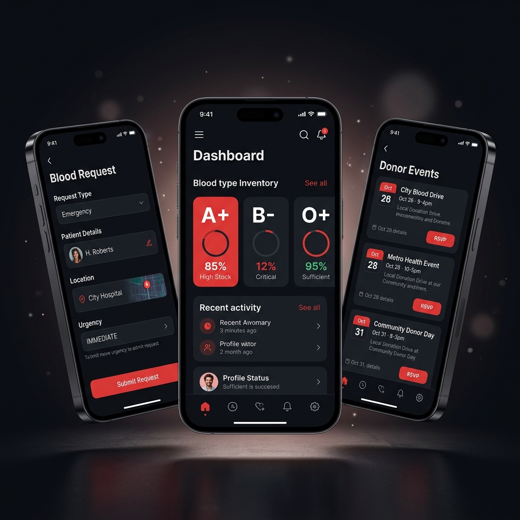
Blood bank administrators needed a tool to manage their actual inventory: what’s in stock, what’s running low, who the registered donors are, and how to process requests from recipients.
Three different people, three different primary tasks. That shaped the whole app structure.
Research First
I talked to blood bank administrators and read through WHO Nepal blood supply reports before designing anything. The most striking number I found: the average time to locate a compatible donor in an emergency was between 2 and 4 hours. My design target was to get that down to under 15 minutes using the app.
The Search Flow
The recipient search is the most important flow in the whole app, and I treated it that way. It’s two steps: select your blood type, see nearby banks with availability. No login. No form. Color codes tell you the status instantly — green means in stock, yellow means limited, red means out of stock. You tap a bank to get their contact details.
This sounds obvious, but the first version I designed had a map view as the default. In testing, people found the list view faster under stress. Maps are great for exploration; lists are better when you know exactly what you’re looking for and you’re panicking.
Keeping Donors Coming Back
The harder design problem was engagement. Most people donate blood once and never return. There’s no follow-up, no feedback, nothing that makes them feel like it mattered.
I designed a donation history timeline for each donor, showing what they’ve donated and when, along with an estimate of how many people their blood could have helped (one donation can impact up to three people). There’s also a countdown to when they’re eligible to donate again, and push notifications for nearby blood drives.
The goal was to make donating feel like an identity, not a one-time transaction. Streak mechanics and community events help with that.
The Administrator Side
Blood bank admins got the most feature-dense part of the app. Inventory management, donor records, the ability to post donation events, and a request fulfillment tool for when recipients contact them through the app.
The admins I interviewed had been managing everything manually for years. When I tested the prototype with them, one said it would replace their entire paper system. That’s the best feedback you can get.
Visual Design
I chose a bold red and white palette. Yes, it’s the obvious choice for a blood-related app, but it’s obvious for a reason: it communicates urgency and trust immediately. The rest of the UI is deliberately clean and minimal so that color is doing as much work as possible without visual noise competing with it.
Large type, high contrast, and clear state indicators throughout. In an emergency, the person using this shouldn’t have to think about how the app works.
Where It Ended Up
This was my final year dissertation project. The blood type search flow was completed in under 90 seconds by every person in the usability test. The administrators who reviewed the prototype confirmed the inventory management features matched how they actually worked, which told me the research had done its job.
It received distinction-level feedback from the university assessors.