The Situation
When I joined Sagarmatha Bytes Tech, this project was already ambitious on paper. A luxury resort in Nepal needed a full Property Management System built from scratch, and I was the only designer on the team. The catch? The client was a startup too. They had requirements built on assumptions about what resort operations might look like, not actual validated research.
So before touching Figma, I spent time at the resort. I talked to the maids, the ayurvedic guru, the chef, the sales team, the admin. I created personas and mapped user flows for each of them. What came out of that was a much messier and more honest picture than the original brief suggested.
13 dashboards. 13 different user types. All of them needed to talk to each other.
The Hardest Design Problem: The Maids
You might expect the most technically complex dashboard to be the hardest to design. It wasn’t. The hardest one was the Housekeeping app for the maids.
The resort’s housekeeping staff are hired locally. Most of them have minimal smartphone experience. Handing them a standard list-based room management interface and expecting them to update room statuses throughout the day was not going to work.
My solution was to throw out the list entirely. Instead, I designed a visual floor map where each room is represented as a custom shape, converted to SVG so it could be rendered efficiently in code. The maids could see the actual layout of the resort, tap a room, and update its status with one tap. No reading required beyond the room number. Color told them everything.
When I tested it with the actual housekeeping staff, they picked it up in minutes. That felt more rewarding than any of the complex dashboards.
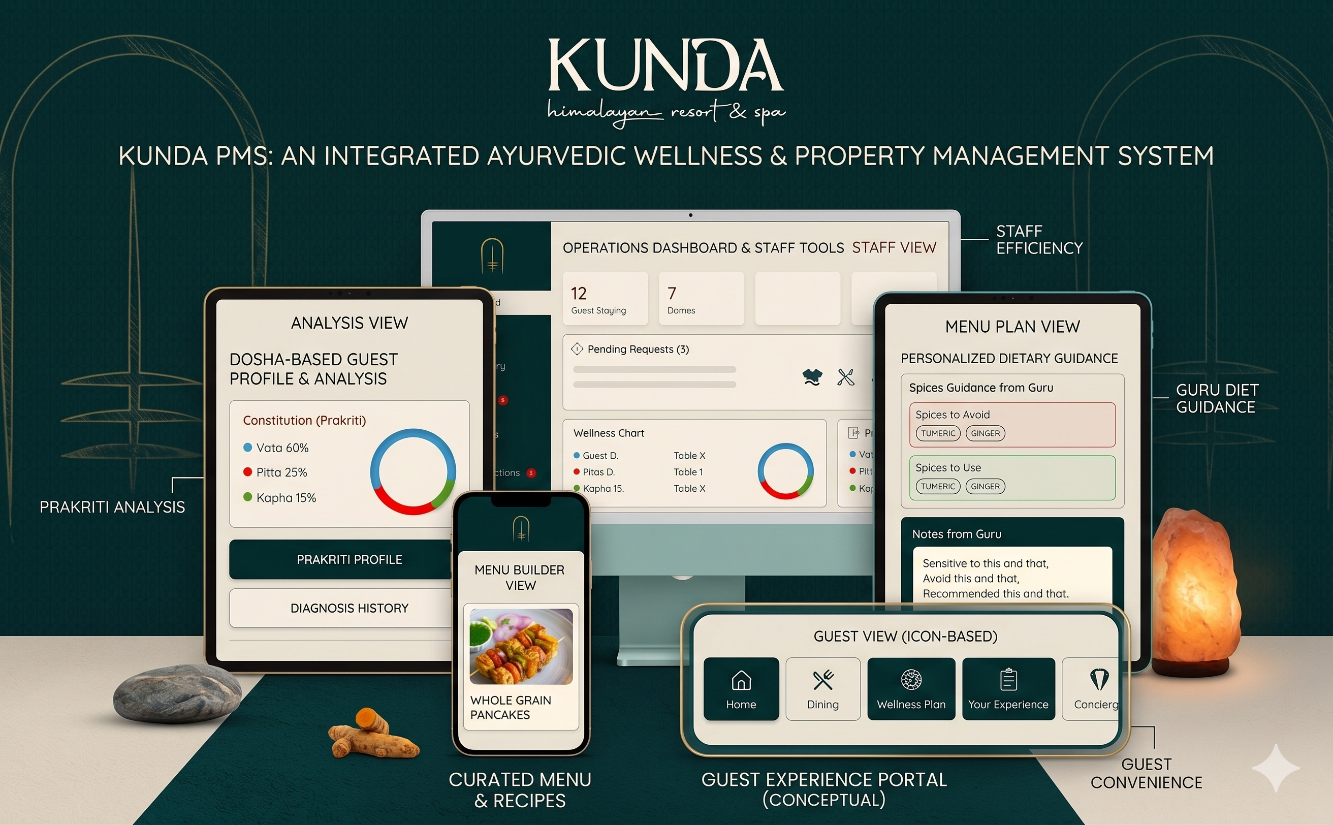
The Ayurvedic Guru App
This one was unlike anything I had seen in a product before. The resort employs an ayurvedic guru who assesses each guest’s dosha constitution (Vata, Pitta, Kapha) and then recommends tailored yoga sessions, massages, and meals based on that analysis.
The problem was that this entire process was happening in the guru’s head, communicated verbally to the chef and the wellness staff. Nothing was tracked, nothing was consistent, and if a guest came back, there was no record.
I designed a system where the guru logs each guest’s Prakriti analysis (body type profile), and the system then automatically surfaces recommendations for that guest across other parts of the resort. The chef sees a suggested meal plan. The wellness team sees the appropriate treatments. The entire recommendation engine is configurable by the guru himself, so he can adjust it based on his own knowledge and experience. No fixed database of rules dictated to him.
This was something no hospitality app had done before. Getting it right required sitting with the guru for hours and understanding how he actually thinks, not how we assumed he thinks.
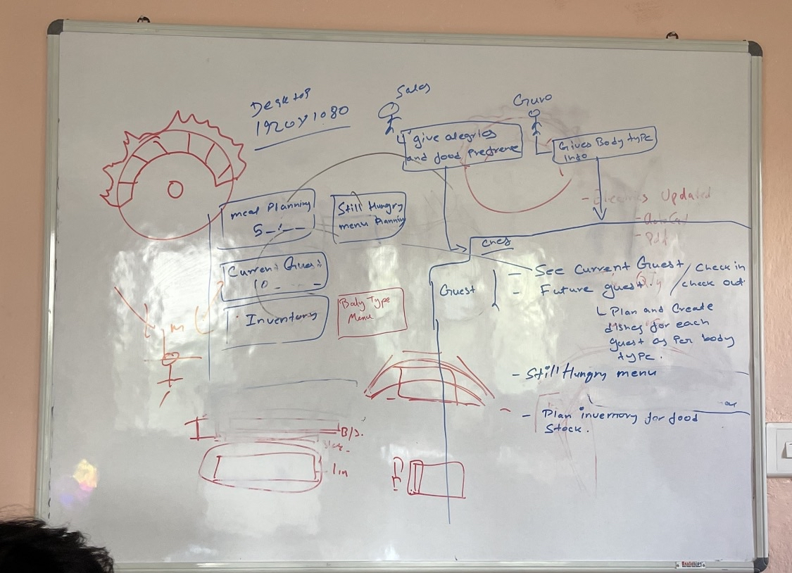
Inventory: A Lesson in Supply Chain Thinking
Luxury resorts have a problem that sounds boring until you see the numbers: they waste an enormous amount of stock. Over-ordering perishables, missing items that expired unnoticed, restocking delays that force last-minute purchases at premium prices.
Before designing anything, I ran a prioritization session using an Eisenhower Matrix to figure out what the inventory system actually needed to solve first versus what was a nice-to-have.
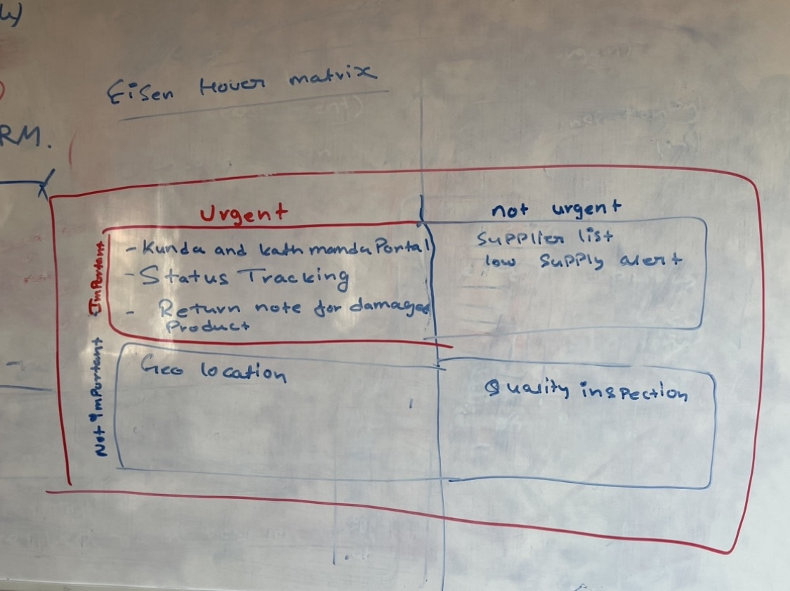
What came out of the research was that the core problem was a lack of visibility across locations. The resort doesn’t just have one storage point. It follows a hierarchy: a Central Warehouse supplies a nearby Site Warehouse, which then sends limited quantities to the Resort for active use.
I designed the inventory system around this hierarchy. Every item is tracked from the moment it enters the central warehouse through every transfer, all the way to consumption, damage, expiry, or loss at the resort level. FIFO tracking ensures older stock is always used first.
The alert system is role-based. When stock at the resort level drops below threshold, it first pings the site warehouse manager. If the site warehouse is also low, the alert escalates to the central warehouse. The right person gets notified at the right time, not everyone at once.
I used Figma Make AI for rapid prototyping on this one, since I had 13 dashboards to cover and needed to move fast without cutting corners on decision-making. Every feature still went through proper research first, including benchmarking how luxury resorts globally manage supply chain issues and which of those problems this system could realistically solve.
The Billing Flow
One of the more nuanced flows I designed was the bill settlement system for the restaurant and butler operations. Guests at a luxury resort often share a dome or suite, multiple people might order together, and payment gets complicated fast.
I mapped the full flow on a whiteboard before going near Figma.
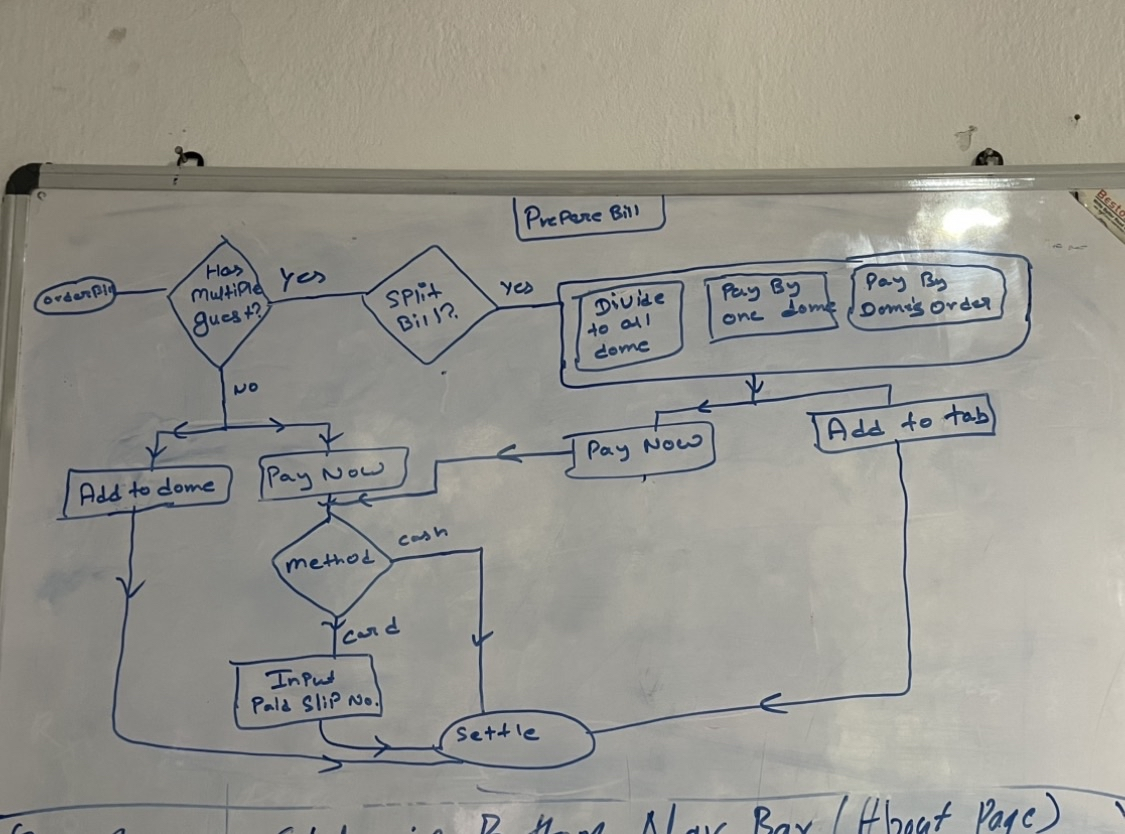
Getting the logic right first saved a lot of rework during design. The flow handles group dining, split billing, “add to dome” tab functionality, and settlement by cash or card.
Resort Admin
The Admin dashboard is where everything comes together for the person running the resort. It covers pricing management across room types and services, revenue reports, guest feedback, and full user management with granular role permissions. There’s also a mini HR module I designed for tracking staff contracts and employment agreements, something the client had never had in a digital format before.
The challenge was information density. Executives need an at-a-glance overview but also need to drill down into specifics without switching tools. I spent a lot of time on the hierarchy of information, making sure the most critical numbers (occupancy, revenue, pending tasks) were above the fold while everything else was one click away.
What Running This Project Taught Me
Working as the only designer on 13 dashboards for a startup client is not something design school prepares you for. There were weeks where I was doing user research, building Figma components, writing documentation, and attending dev QA calls all at the same time. I tracked everything in Jira to stay on top of it.
The biggest lesson: complexity at scale comes from the connections between things, not the individual screens. Any one of the 13 dashboards was manageable on its own. The hard part was making sure that a status change in housekeeping updated the correct view for the butler, which updated the guest-facing portal, which reflected in the admin reports. Getting that data architecture right early was what made the rest of the design defensible.
The second lesson was more personal. I designed for 13 different people in 13 different contexts, and the outcome I’m proudest of was the simplest one: a maid who had never used a management system before picked up the housekeeping app and figured it out on her own. That’s the kind of result I want to keep designing for.